Atmoz
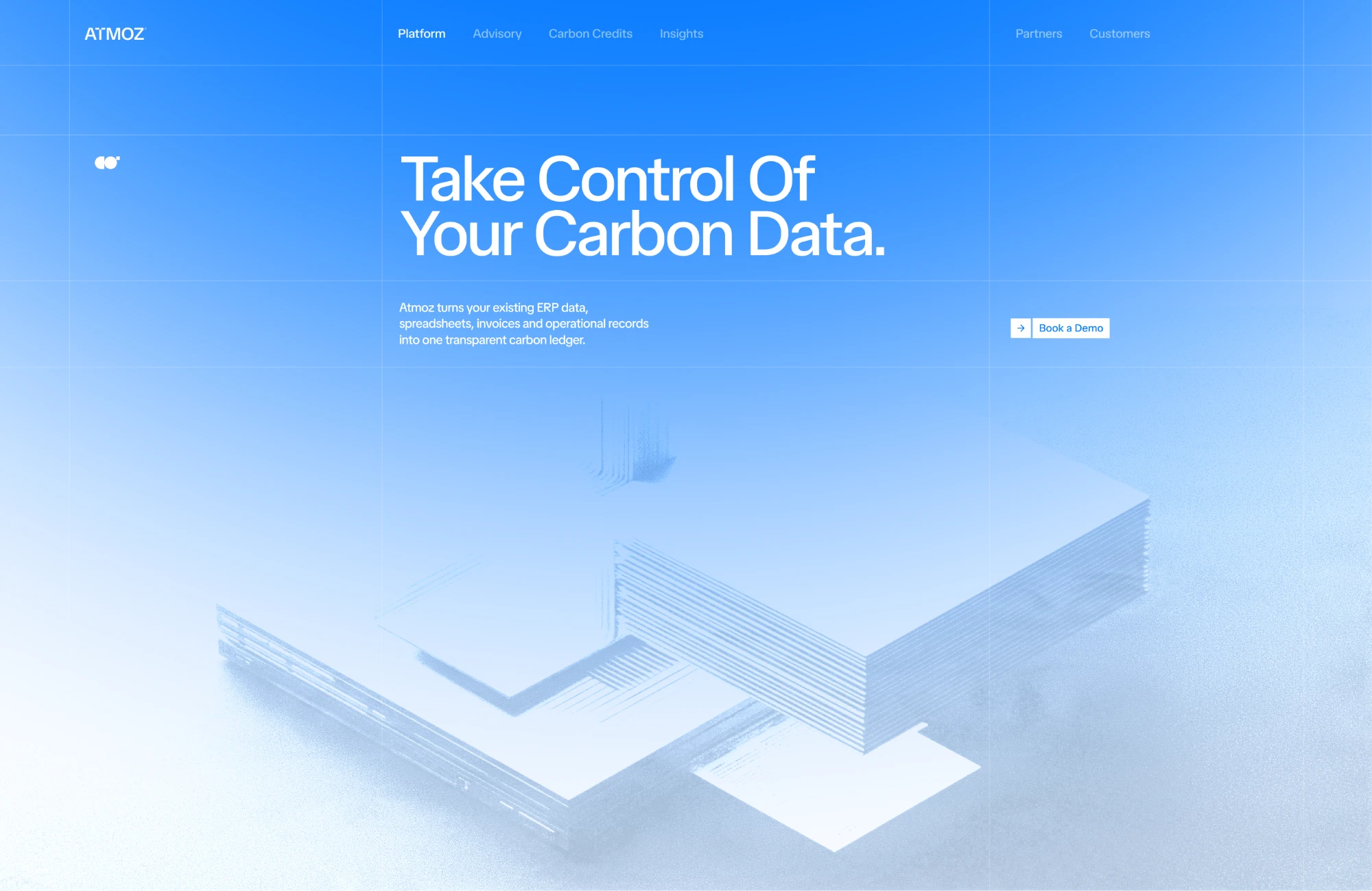
A clear, confident identity that makes carbon data feel calm and credible.

The challenge
(+) ApproachCustomers report Atmoz’s numbers to regulators and investors, so the brand had to earn trust at first glance.
Atmoz turns messy carbon data into something companies can act on, but its brand looked as technical as the spreadsheets it replaces. When buyers trust you with numbers they report onwards, a brand that feels improvised makes that trust harder to earn.
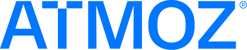
The logo is a confident wordmark, clean and steady, so the name itself carries the credibility the product needs.
The palette is built on a calm blue, from a clear Atmoz Blue to a deep navy. Blue signals trust and clarity, and keeps a technical product feeling calm rather than complicated.
Deliverables
What I deliveredLogo
Colors
Results
What the identity doesCredible at first glance.
A confident wordmark and a calm blue make Atmoz look like a brand you can report numbers from.
Faster brand recognition.
A clear, consistent look sets Atmoz apart from the spreadsheets and dashboards it competes with.
Calm, not complicated.
The palette keeps carbon data feeling clear and steady instead of technical and stressful.

Let’s MakeYour WebsiteIdentifiable
Book a call