Celaro
A bold, fast identity that makes a technical product easy to trust.

The challenge
(+) ApproachA new product that needed to stand out from the very first launch.
Celaro was a new product on the market, and a clear visual identity was key to making it stand out, not least in its Product Hunt launches.
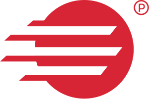
The logo is built from speed lines, a nod to how fast Celaro lets you work. The red was chosen to communicate how sharp the product is, and to make it stand out, since people are naturally drawn to red.
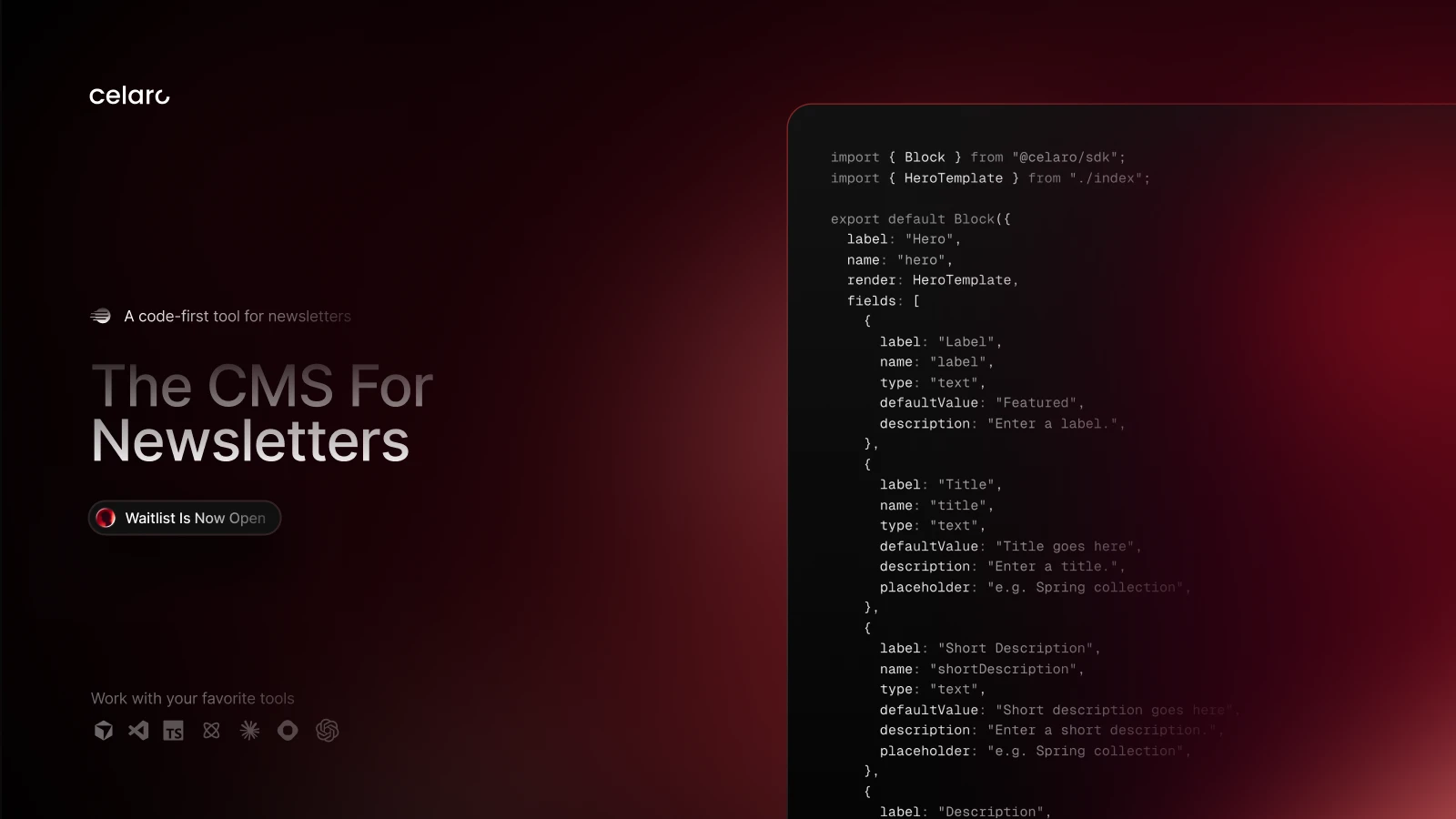
For typography, the unique touch was running gradients through the type. It turns the headlines themselves into part of the identity, so Celaro is recognisable from the type alone.
Deliverables
What I deliveredLogo
Colors
Results
What the identity doesRecognisable at a glance.
The speed-line mark and the sharp red make Celaro easy to spot, from a launch page to a browser tab.
A product that feels fast.
The identity tells the story before anyone reads a word: Celaro is quick and sharp.
Ready for every launch.
One clear look across the site, socials and Product Hunt, so every launch reads as the same brand.

Let’s MakeYour WebsiteIdentifiable
Book a call