Ellie
A warm, friendly identity that makes Ellie easy to recognise and hard to forget.
The challenge
(+) ApproachEllie had no clear identity and no real logo, only a purple palette that was already partly in use.
Ellie started out without a clear identity or a real logo, only a purple palette that was already partly in use. Since the purple was the one thing Ellie already owned, I chose to build on it rather than start over.
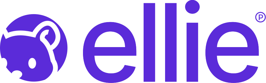
The logo tells the story behind the product (yes, Ellie is a hamster), and the visual world around it is designed to feel cozy and warm.
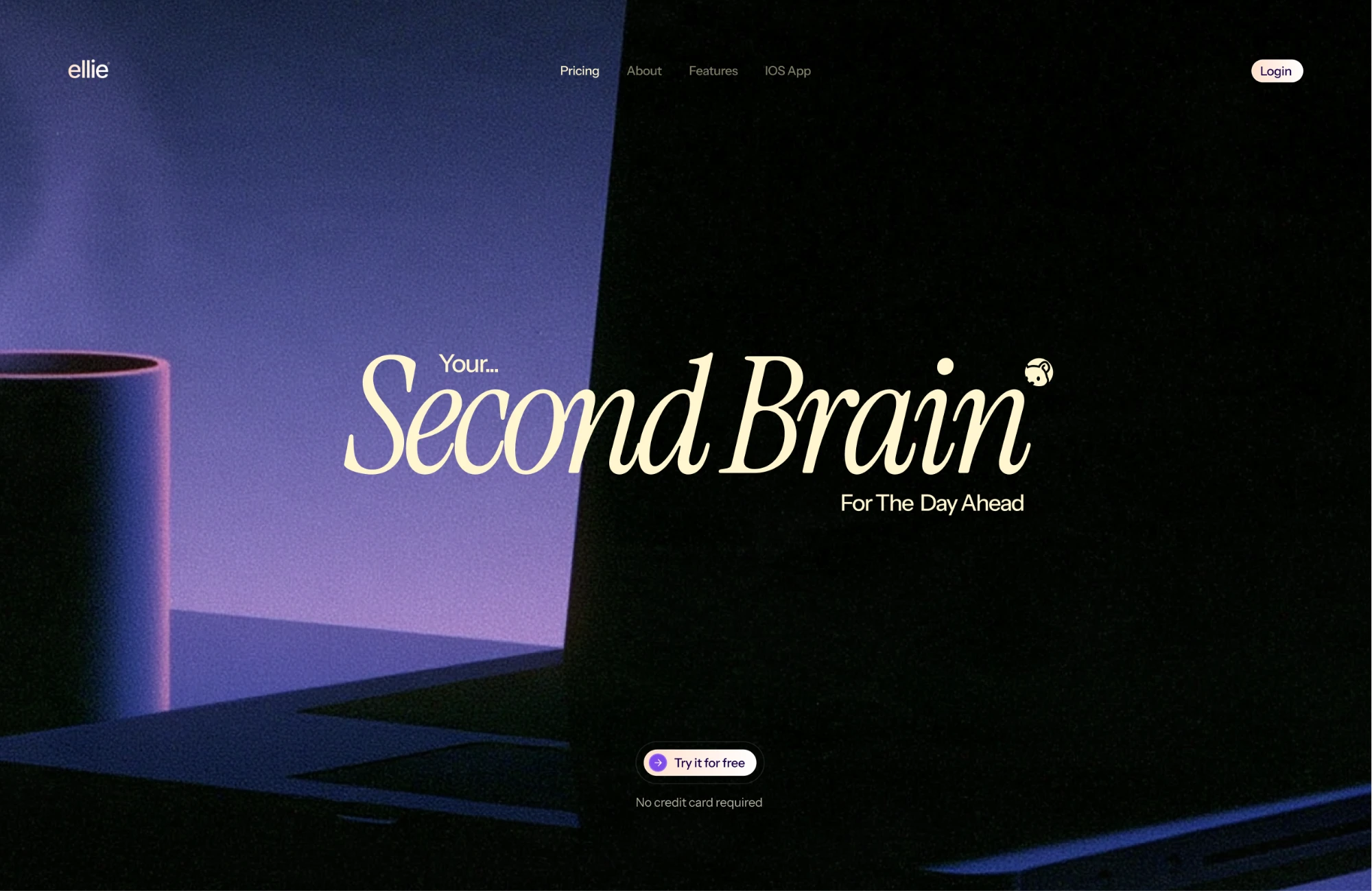
For typography, I paired a serif with a sans serif. The serif brings warmth and gives Ellie its personality, while the sans serif keeps things clean and balanced.
Deliverables
What I deliveredLogo
Colors
Results
What the identity doesA brand people remember.
The hamster gives Ellie a face and a story, which makes the name stick long after the first visit.
Warm and easy to trust.
The soft purple and a friendly serif make Ellie feel approachable from the very first screen.
Still unmistakably Ellie.
Building on the purple it already owned means existing users recognise Ellie straight away.

Let’s MakeYour WebsiteIdentifiable
Book a call